Brand identity v4, effective May 2026
The Frame.
A clean rounded square with two diagonal corner cuts and a single offset dot. The frame is the scene, the dot is the character in it. This page is the source of truth for how the Roleplay Project mark is used.
Read this before you design anything
These rules keep the brand consistent everywhere it appears. The website, the launcher, in-game UI, Discord, the forum, merchandise, video thumbnails and partner integrations. Every surface that carries the mark represents the project, so following them is not optional.
- The Frame. The geometric icon. A chamfered square with an offset dot. Stroke #EEF2F8 on dark, #0A0D12 on light. The dot is always #58A6FF.
- The Wordmark. Roleplay in Onest 700 plus Project in Onest 500, letter spacing -0.05em, never separated by more than one space.
- Four lockups. Horizontal (default), stacked, mark only, wordmark only. Always pick one of these. Never invent a fifth.

Logo assets
Each mark is shown on the surface it is built for. Download the file, drop it in, and do not re-export the geometry from a raster source.
The Frame, default
Stroke #EEF2F8, dot #58A6FF. Use on any dark surface between #0A0D12 and #21262D.
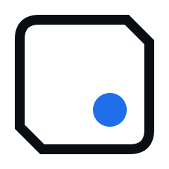
The Frame, light variant
Black stroke, blue dot. Use on white, paper and any light backplate.

The Frame, animated
Identical geometry. The stroke draws itself once, then the dot breathes. For loaders and title cards only.

Favicon
Heavier stroke and a larger dot so the mark survives at 16px. Never shrink the full mark instead.
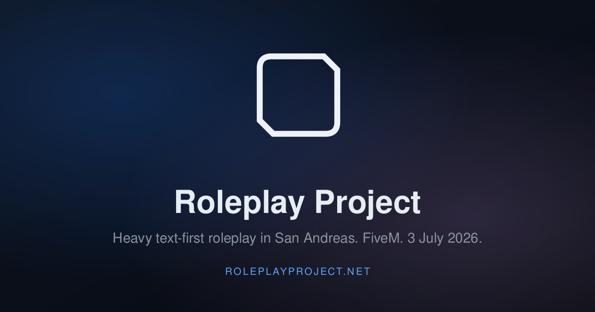
Open Graph card
1200 x 630 social preview. Used for link unfurls on Discord, X and search results.
For developers. On the marketing site, the UCP and the API, the mark is served from /brand/frame.svg and the favicon from /brand/favicon.svg. Reference the file, do not paste a copy of the path data into your own component.
Geometry
240 x 240 user units. A rounded square with two 45 degree chamfered corners, top right and bottom left, and two rounded corners, top left and bottom right. A single solid dot sits offset toward the lower right.
- Bounding box
- 240 x 240 user units
- Stroke width (default)
- 14u
- Stroke join
- miter, stroke-miterlimit 2
- Rounded corners (TL, BR)
- 36u radius, Q 28,28 56,28 and Q 212,212 184,212
- Chamfer corners (TR, BL)
- 48u at 45 degrees
- Dot centre
- (156, 156), 65% across and 65% down
- Dot radius
- 24u
Size compensation
At smaller display sizes, increase the stroke so the frame stays visible.
- 64px and above
- stroke-width 14, dot r=24
- 40px
- stroke-width 16, dot r=24
- 24px
- stroke-width 18, dot r=24
- 16px
- stroke-width 20, dot r=28
- Below 16px
- Use favicon.svg. Do not shrink the full mark
Typography
Three faces, each with one job. Do not add a fourth.
Display
Onest
The wordmark and every heading. Weights 500 and 700 only. Roleplay is 700 in #EEF2F8, Project is 500 in #9098A6, both tracked at -0.05em.
Body
Inter
All running copy, UI labels and long-form documents. Never used for the wordmark.
Data
JetBrains Mono
Numbers, timestamps, status labels, file paths and hex values. The optional caption row under the wordmark is JetBrains Mono 600, 11px, 5px letter spacing, in #6B7382.
The four lockups
Always pick one of these. The horizontal lockup is the default. Use it for every header, every nav bar and every partner integration unless the layout demands one of the others.
A, horizontal (default)
B, stacked
C, mark only
D, wordmark only
- Horizontal, the default
- Anywhere with horizontal headroom. Navigation, hero panels, email headers, partner cards.
- Stacked
- Narrow layouts. Mobile sidebars, square social cards, vertical video thumbnails.
- Mark only
- Avatars, favicons, app icons, watermark badges. Any 1:1 context where the wordmark would be illegible.
- Wordmark only
- Surfaces where the context is already established. The logged-in dashboard, in-game UI, footer column titles.
Colour palette
A tight palette. The dot is the only element allowed to take colour. Surfaces, stroke and type all sit on a narrow set of values.
Surface tokens
CANVAS
Canvas
#0A0D12
Page background, off stage
SURFACE / 1
Surface 1
#0D1117
Default raised cards
SURFACE / 2
Surface 2
#161B22
Nested cards, panels
SURFACE / 3
Surface 3
#21262D
Hover, overlay, chip
Type
BRIGHT
Bright
#EEF2F8
Headlines and the word Roleplay
DIM
Dim
#9098A6
Body text and the word Project
MUTED
Muted
#6B7382
Captions and file references
Accent
DOT
Accent, Dot
#58A6FF
The dot. The only colour allowed inside the mark
DEEP
Accent, Deep
#388BFD
Hover and pressed states
PRESSED
Accent, Pressed
#1058C0
Backplate gradients
Do and do not
The most common misuses, paired. If something you are doing matches a do not, stop and use the do beside it instead.
Do
Use the SVGs we ship.
Always source the mark from /brand/frame.svg or one of the variants on this page. Never re-draw it, trace it from a screenshot, or rebuild the geometry.
Do not
Do not redraw or improve the geometry.
No rounding the chamfered corners, no recolouring the stroke, no moving the dot, no removing the dot. The path is final.
Do
Respect the clear space.
Leave at least 20% of the mark's height as empty space on every side. No text, edges or other elements inside that buffer.
Do not
Do not crowd or crop the mark.
No partial cuts, no overlays, no badges sitting on top of the frame. If space is tight, scale the mark down instead of cropping it.
Do
Use the right colourway for the surface.
On dark backgrounds between #0A0D12 and #161B22 use the white stroke with the blue dot. On light backgrounds use the black stroke with the blue dot.
Do not
Do not introduce new colours.
Only the dot may take colour, and only from the approved colourways. No gradients on the stroke, no drop shadows, no glow effects.
Do
Use Onest for the wordmark.
Roleplay is Onest 700, Project is Onest 500, both at -0.05em letter spacing. The optional caption row is JetBrains Mono 600 at 11px with 5px letter spacing.
Do not
Do not substitute the typeface.
No Inter, no system fonts, no italics, no all caps for Roleplay Project. Typesetting the wordmark in another face breaks the system.
Do
Scale the stroke at small sizes.
Below 64px, increase the stroke width and dot radius so the frame stays legible. Use the size table above.
Do not
Do not use the mark below 16px.
At less than 16px the geometry collapses. Use the simplified favicon or drop the icon entirely.
Do
Pair it with our palette.
Surfaces use the dark tokens on this page. Accent blue is #58A6FF. Type whites are #EEF2F8 and #9098A6.
Do not
Do not place the mark on busy photography.
If the background is a photo, put the mark on a solid backplate or use the wordmark-only lockup. The stroke needs contrast to read.
Brand violations get pulled. Any merchandise, video, partner integration or community asset that breaks these rules will be asked to fix or remove the mark. If you are not sure, ask Phytoventures Ltd first at [email protected].
Questions, partner requests, takedowns
The brand sits with Phytoventures Ltd. For partner integrations, merchandising, video or podcast use, or anything that puts our mark on a surface we do not control, ask first.
- Operator
- Phytoventures Ltd, company 16388003, Belmont Suite, Chorley New Road, Horwich, Bolton, BL6 6HG
- Brand and partner enquiries
- [email protected]
- Legal and takedowns
- [email protected]
- Identity version
- v4, effective May 2026, supersedes all prior marks